BASED ORIGINS

BASED ORIGINS

brand identity

brand identity

Brand Identity for ‘not another
supplement brand’: Based Origins

Brand Identity for ‘not another supplement brand’: Based Origins

Brand Identity for ‘not another
supplement brand’: Based Origins

About the project

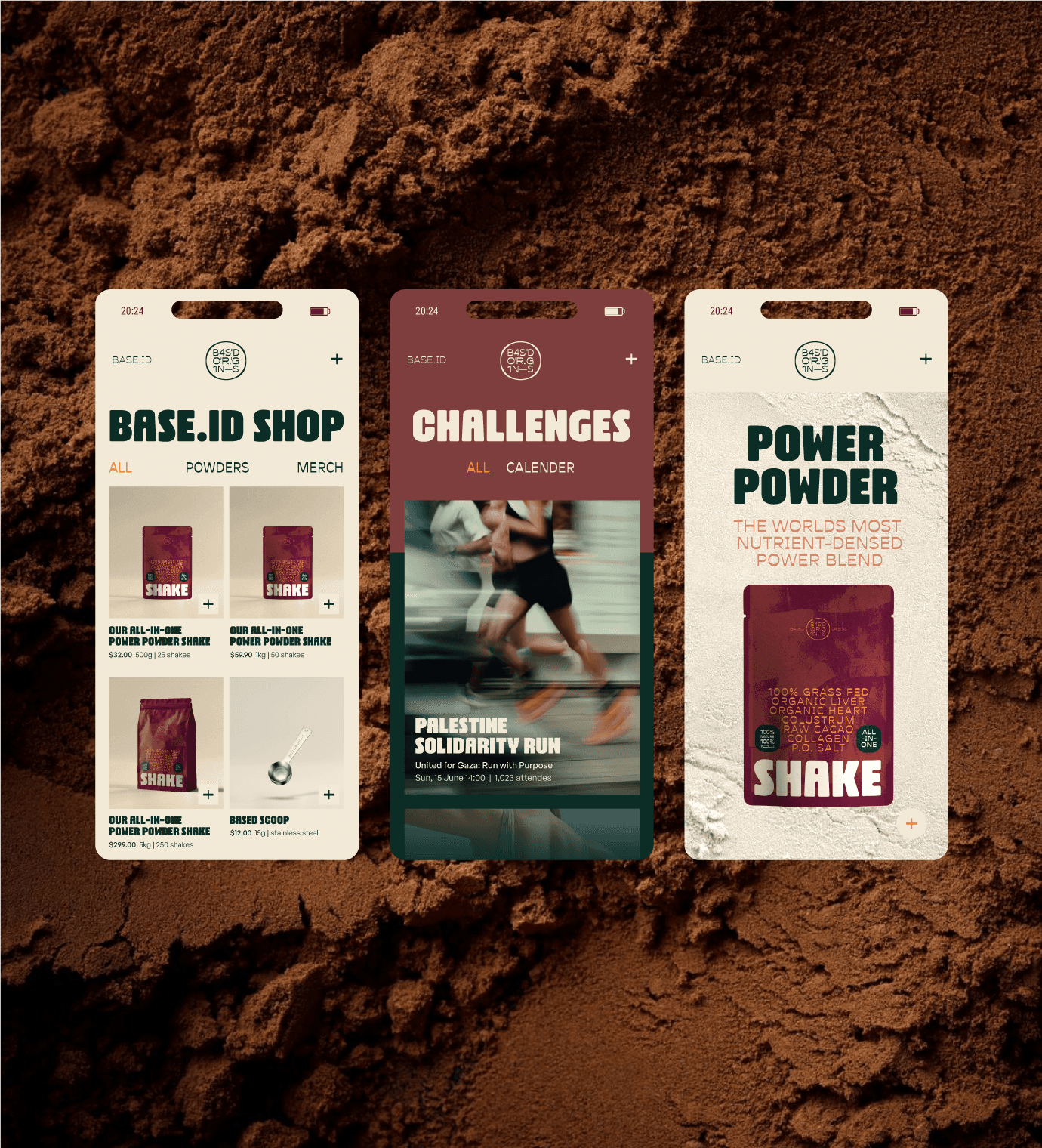
Based Origins is "not another supplement" brand. In a wellness market flooded with conflicting opinions and advice on healthy living, Based Origins chooses to return to the basics. According to Based Origins, other brands have made things unnecessarily complicated, so they’re introducing an all-in-one shake: the world's most nutrient-dense power blend.

I designed a complete brand identity for this brand, which aims not only to sell a product but to build a community around the lifestyle concept of 'being based'. This includes packaging that stands out in the otherwise monotonous supplement aisle, emphasizing key features like 100% grass-fed animal ingredients, great taste, and the shake's powerful benefits

Roles:

Creative concept
Design direction
Logo design

Brand Identity design
Packaging design

A GUIDiNG LOGO

Our logo is a creative translation of our brand name, presented as coordinates. It symbolizes a place—a mental space we call 'based,' where you are 100% yourself.

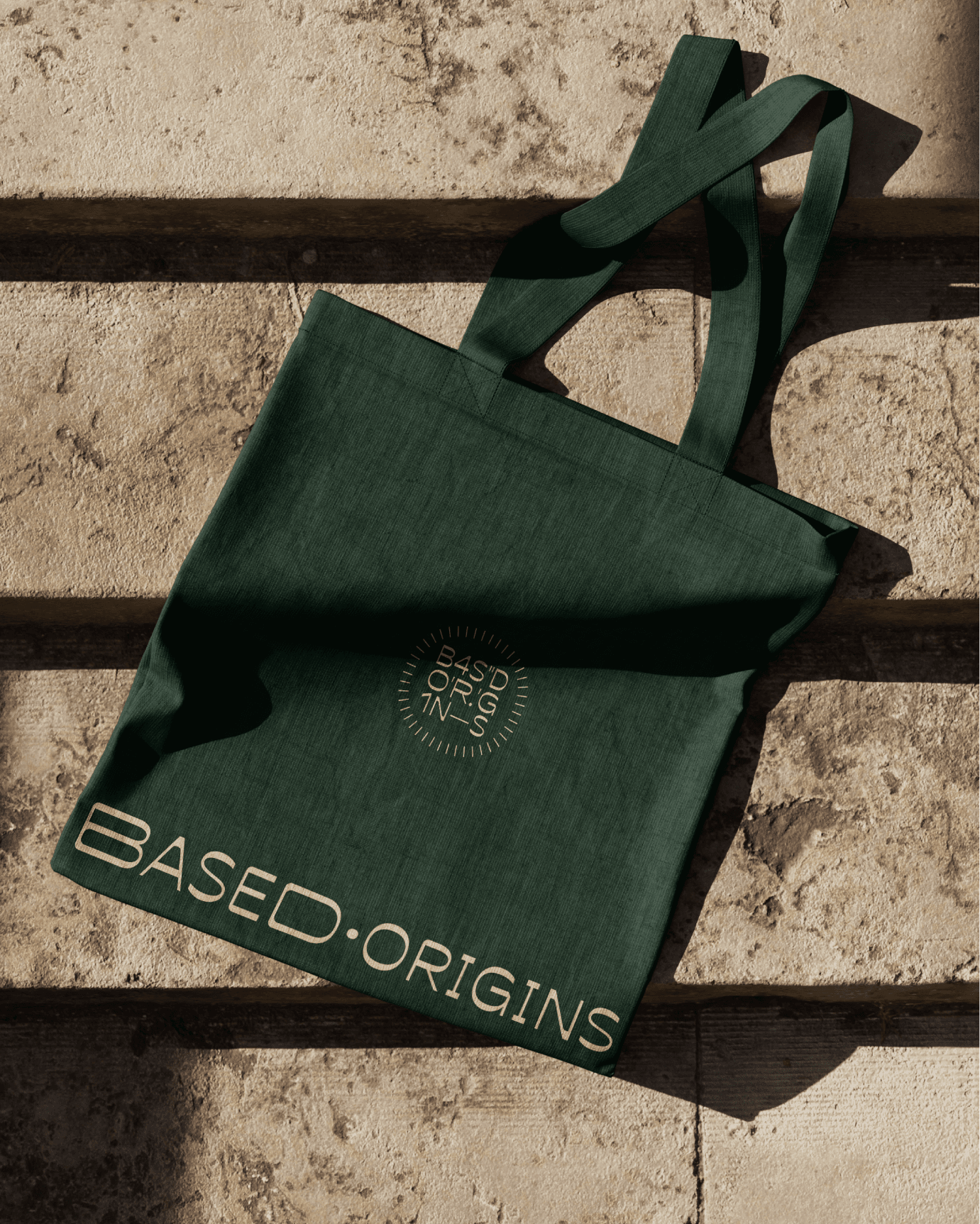
As our DBA, we use the mark to serve as a guiding beacon for self-discovery or a seal of approval for the exceptional quality of our pure ingredients.

The design evokes a sense of ancient mystery, paying homage to our ancestors who understood that a healthy lifestyle does not need to be complicated.